
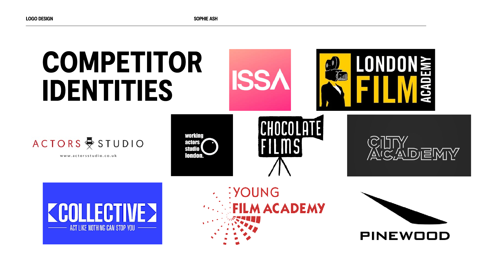
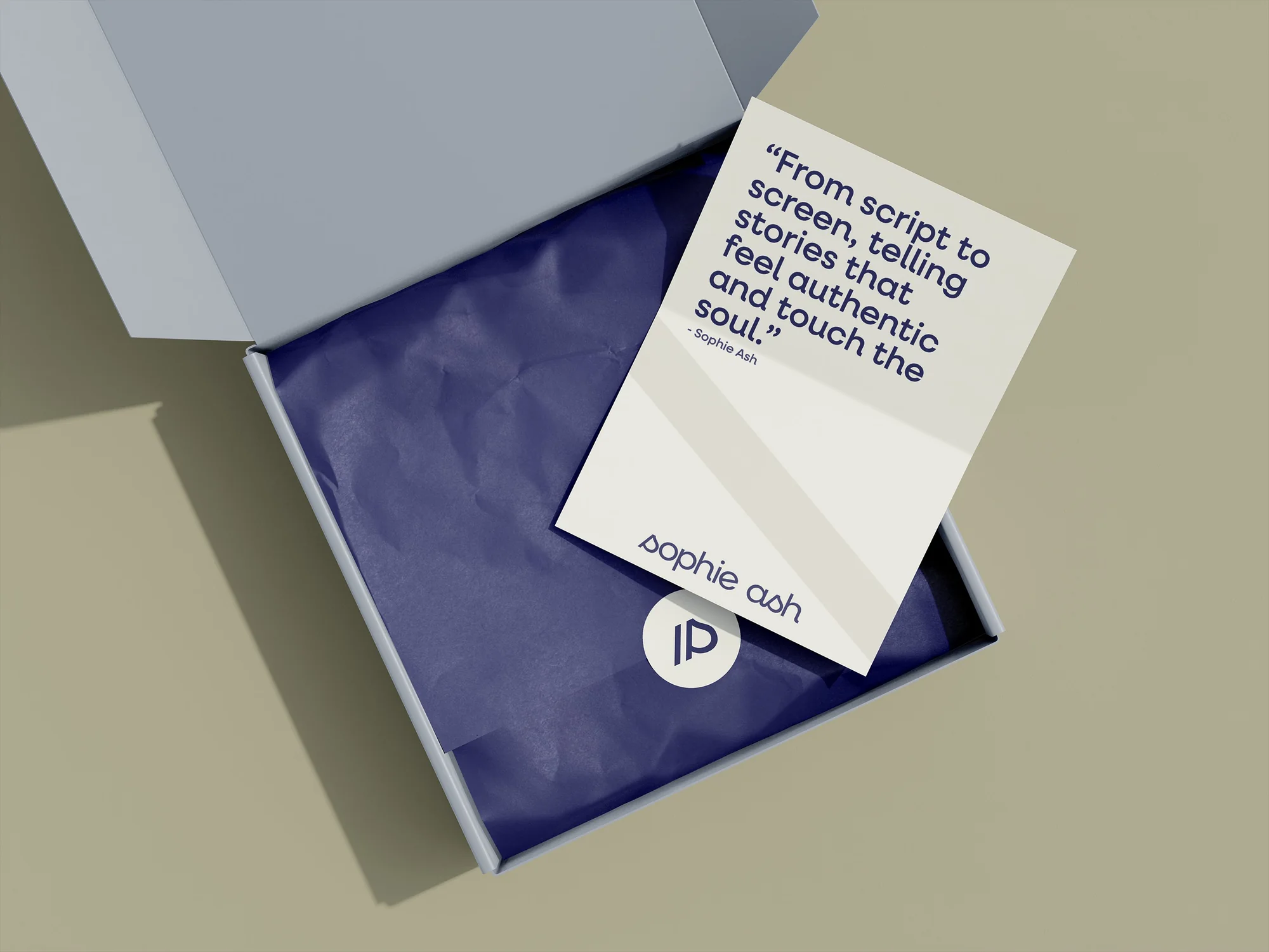
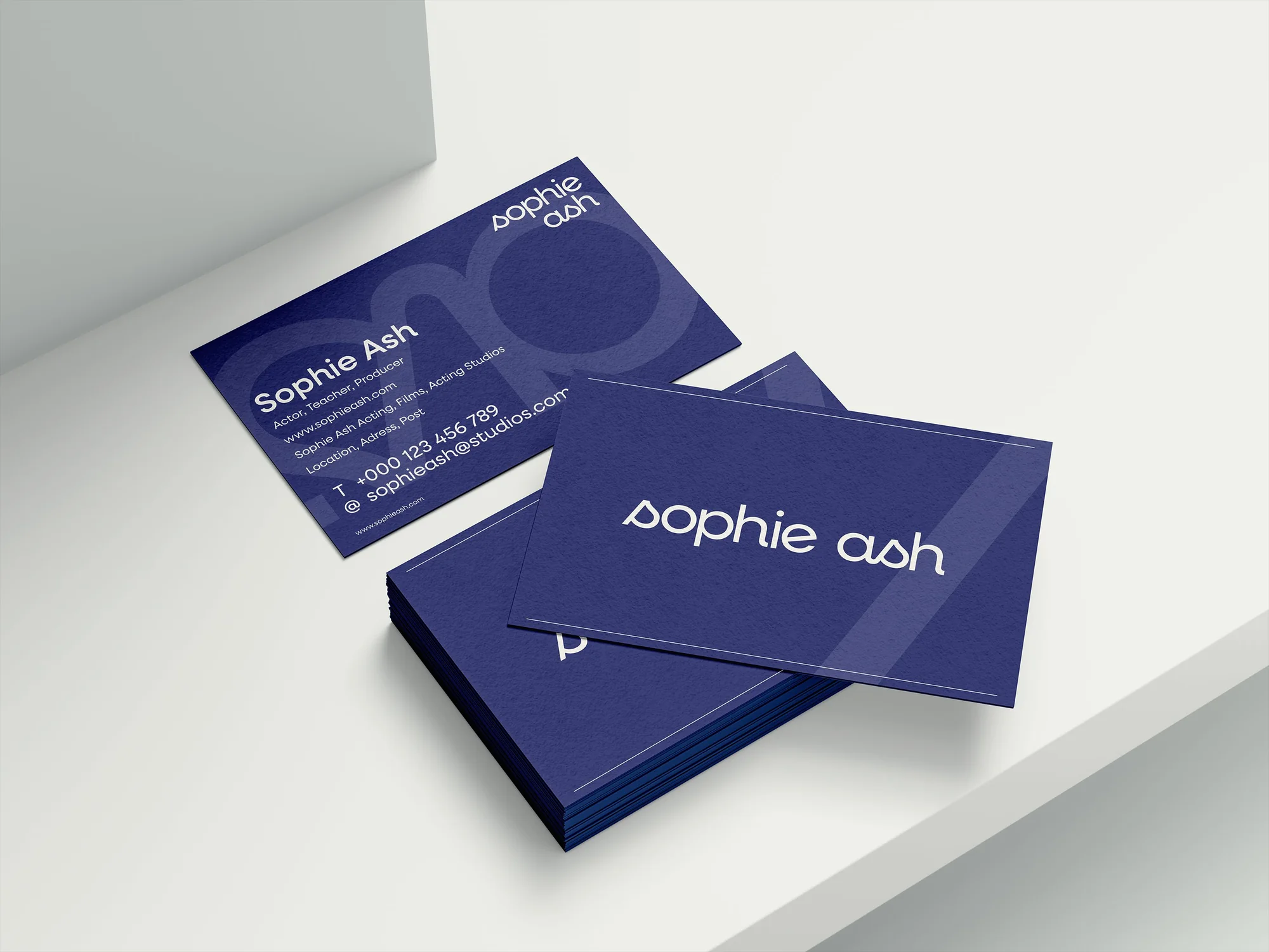
Sophie Ash is an actor, teacher and producer building a career under her own name. Most acting brands lean on the same clichés, clapperboards, spotlights, film reels. She needed something different: a personal brand that felt modern, warm and unmistakably hers.
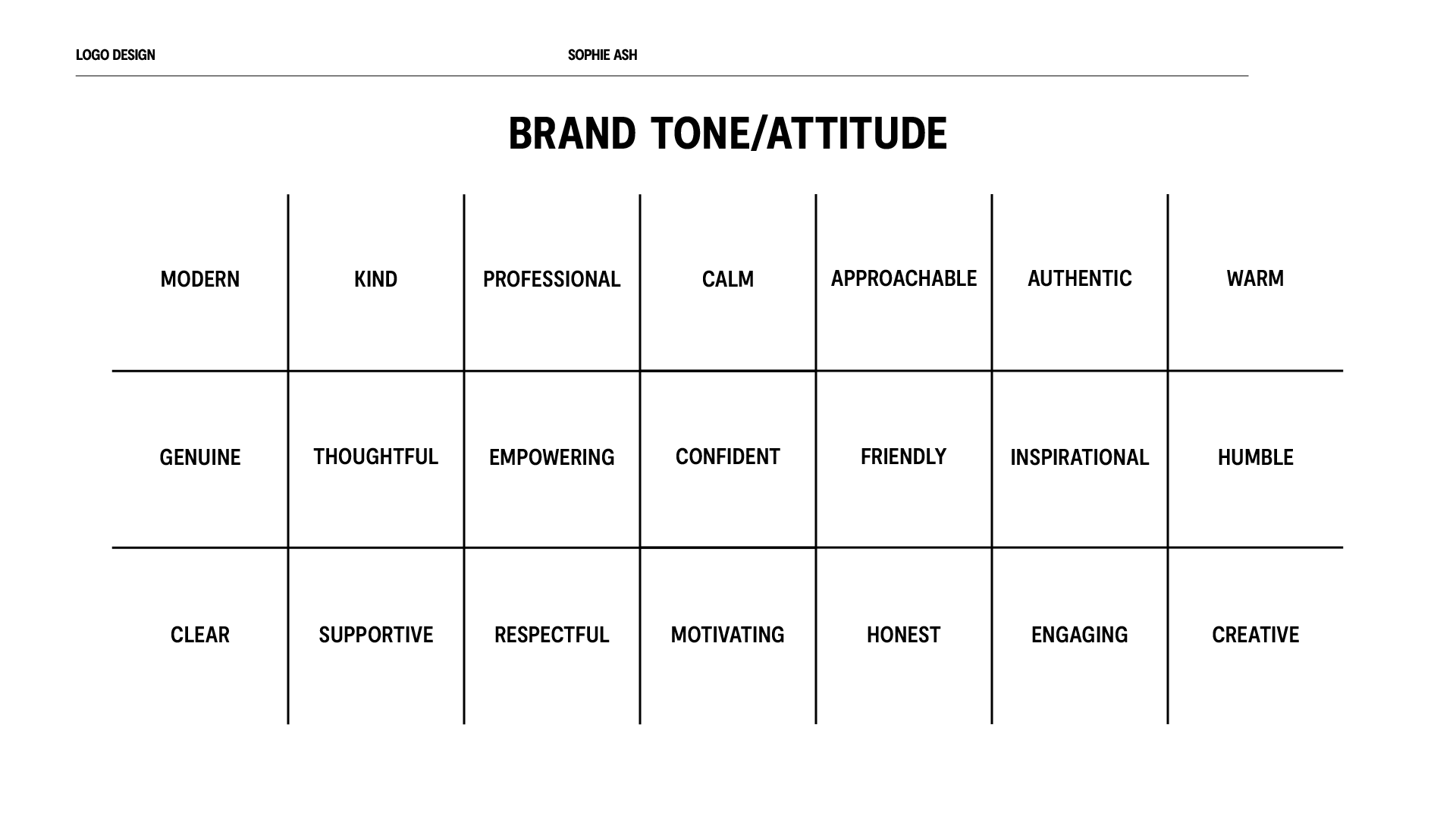
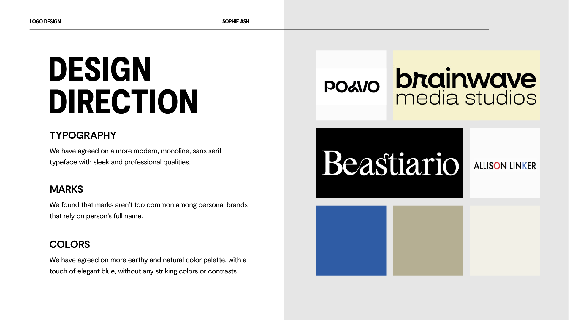
I set a clear direction: a modern monoline logotype, an earthy but elegant palette of royal purple and soft marble, and a voice that reads professional but genuinely warm. Marks are rare on name-led personal brands, so any symbol had to earn its place.
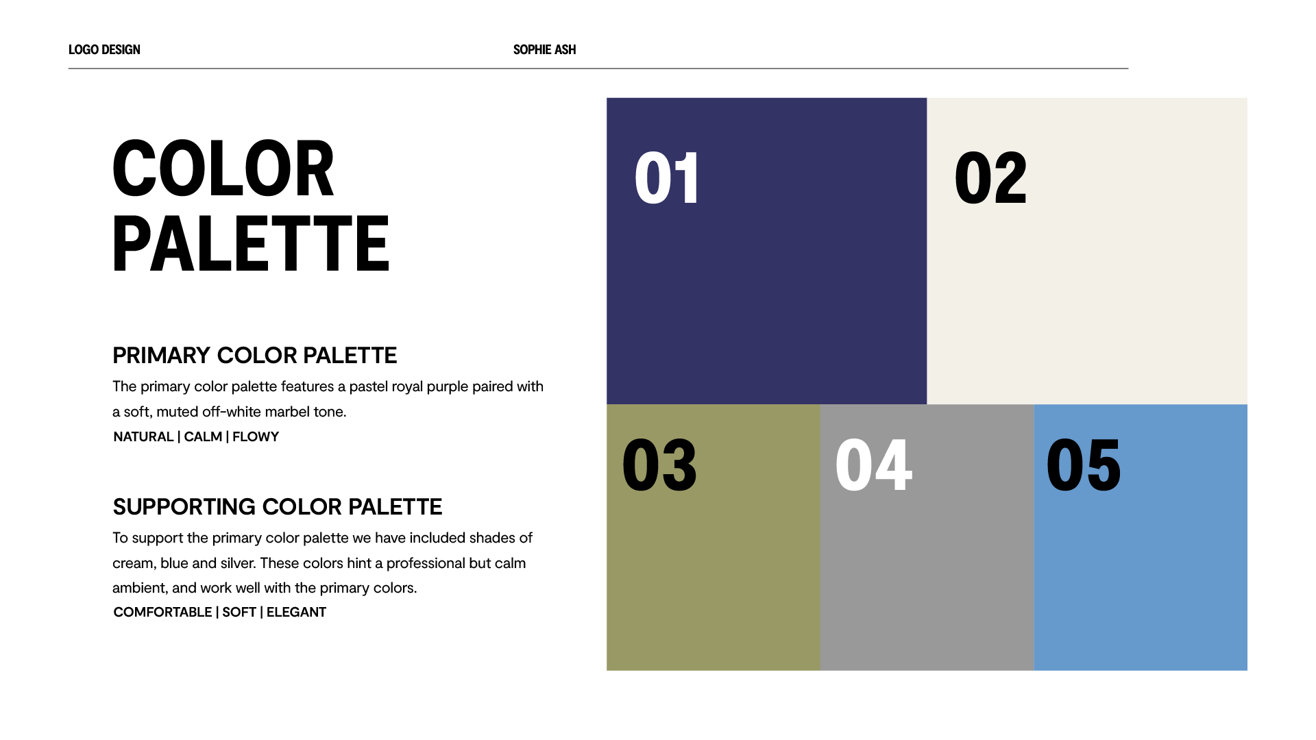
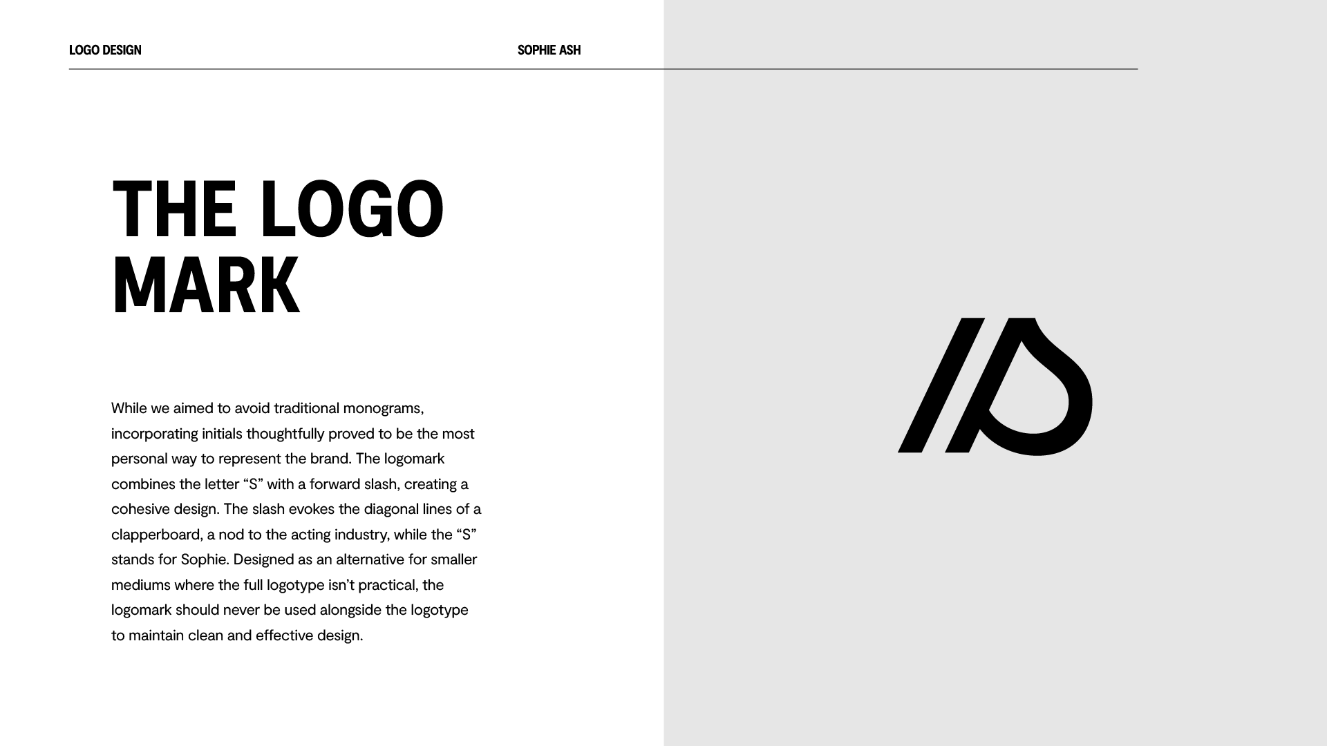
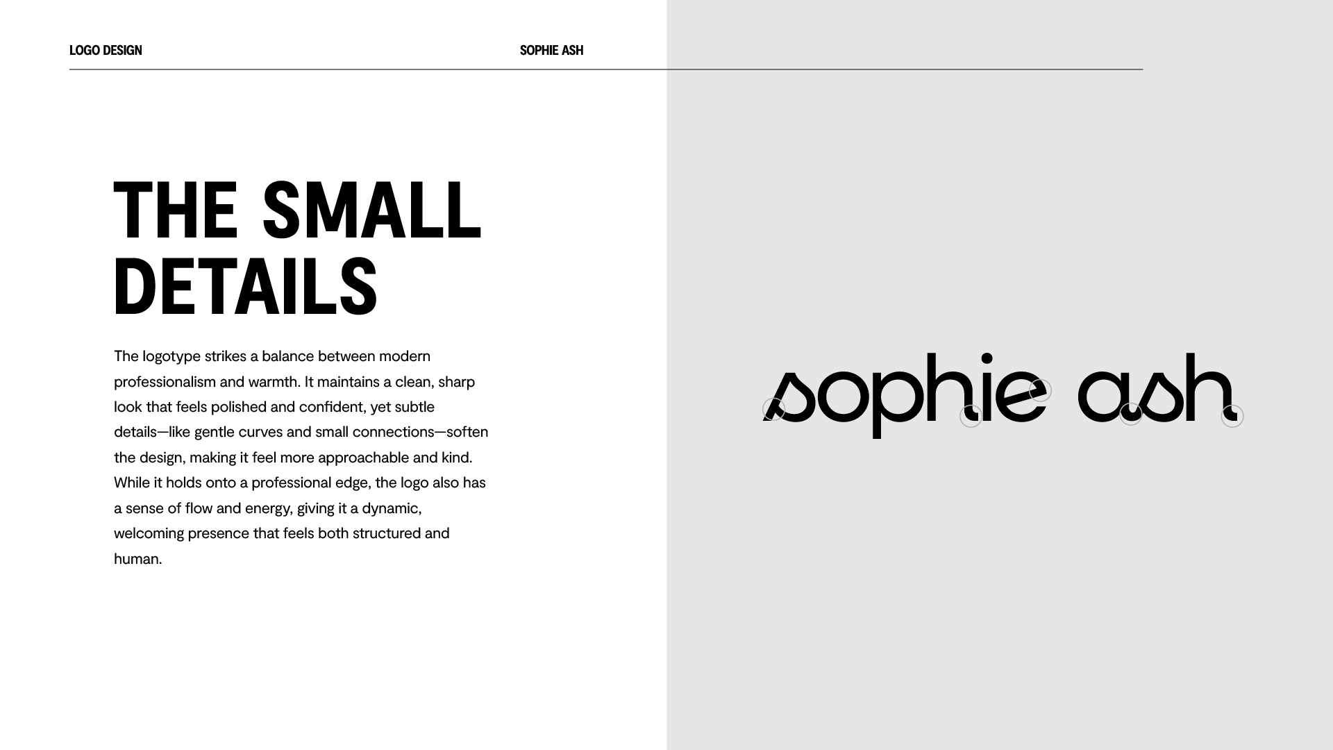
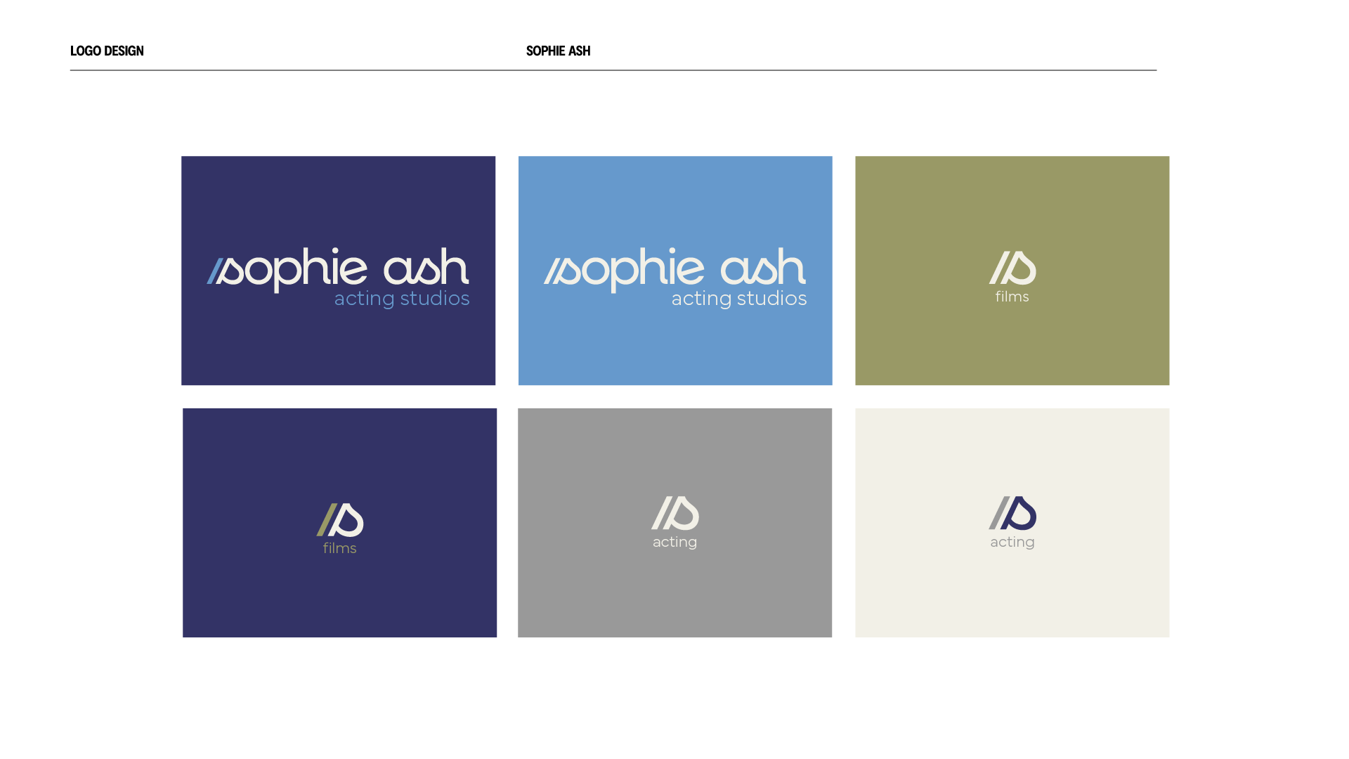
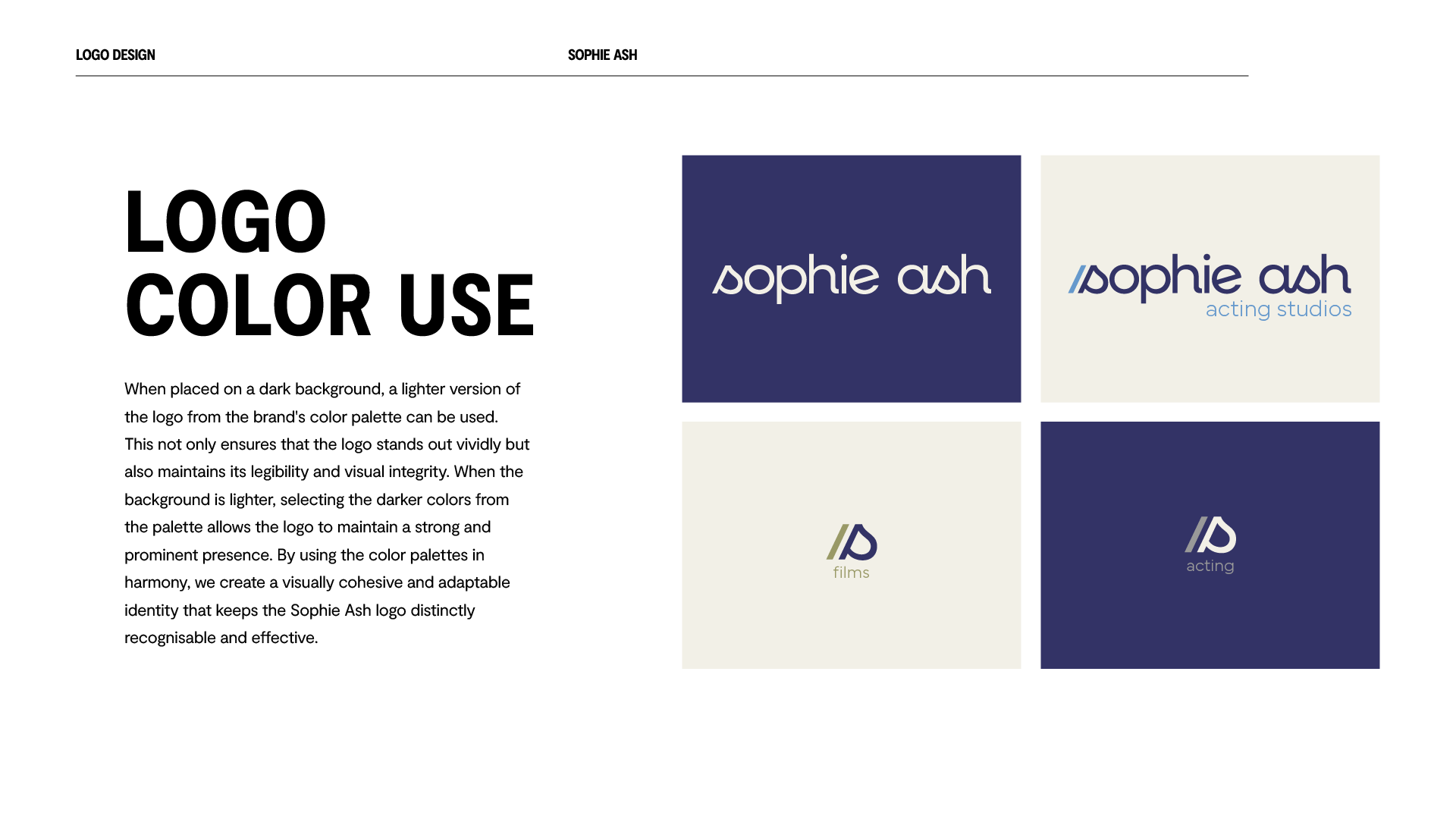
The logotype balances clean geometry with gentle curves that keep it human. A compact 'S'-and-slash monogram, a quiet nod to a clapperboard, flexes across her acting, teaching and producing work, and the palette carries the brand from a dark business card to a film set. The result is a personal brand that feels structured and alive.

“He listened to every idea and made it clearer than I could. I'm so pleased the brand represents me and my work this well.”
Sophie Ash, Actor, teacher & producer