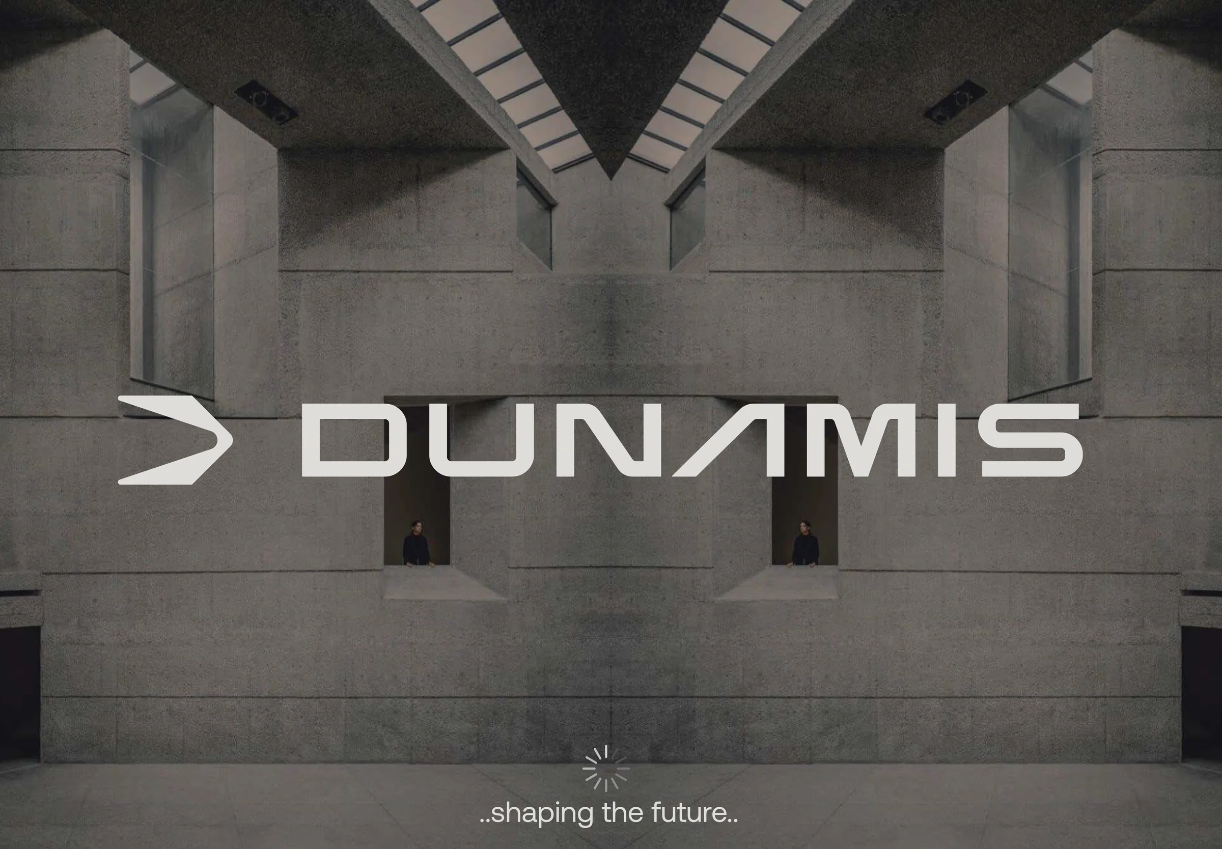
Dunamis, Greek for power and potential, set out to build the most advanced personal trimmer on the market, sold direct through its own app. But the category is full of loud, near-identical gadgets. To stand out, Dunamis needed a brand as precise and forward as the product itself, not another lookalike on the shelf.
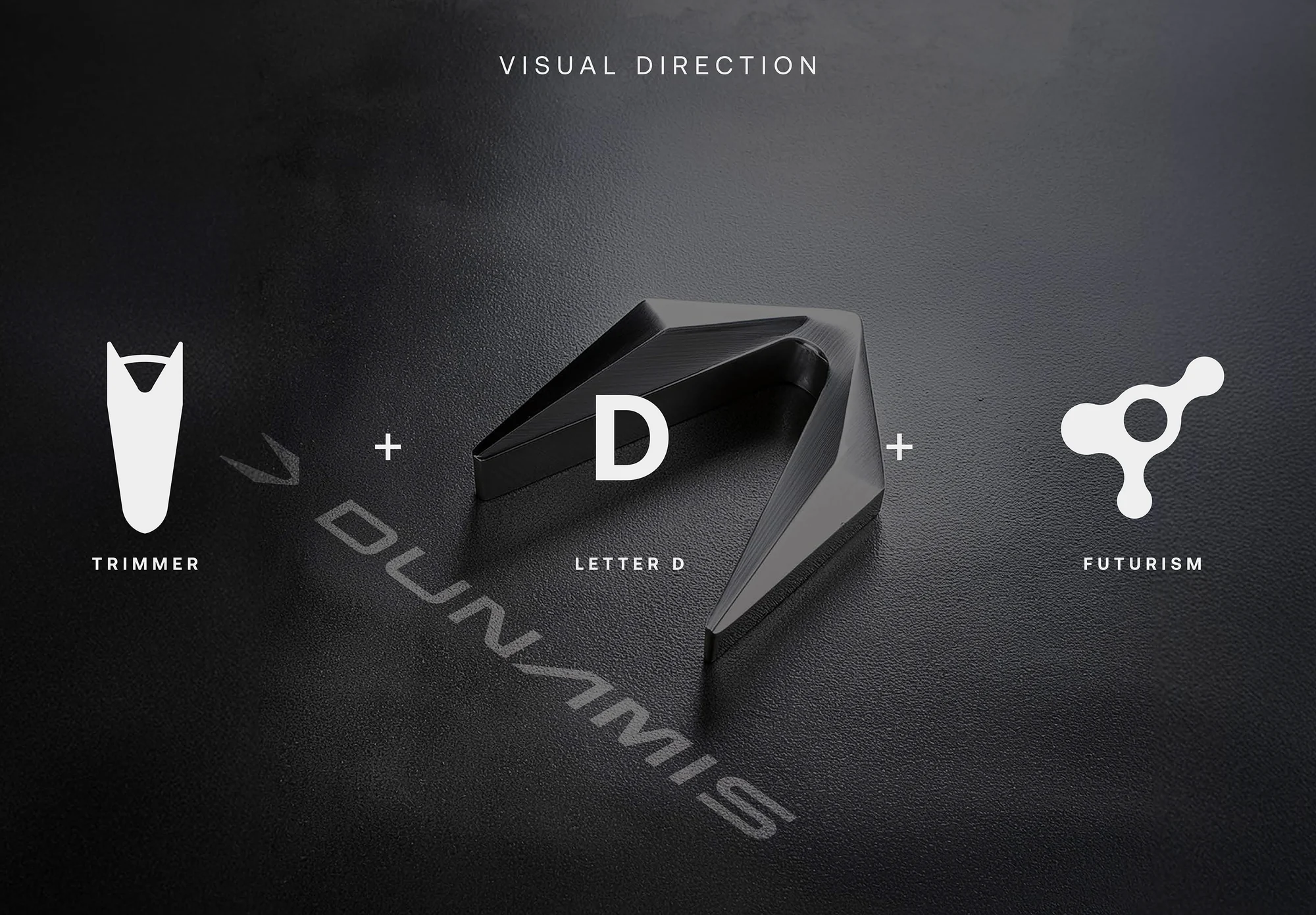
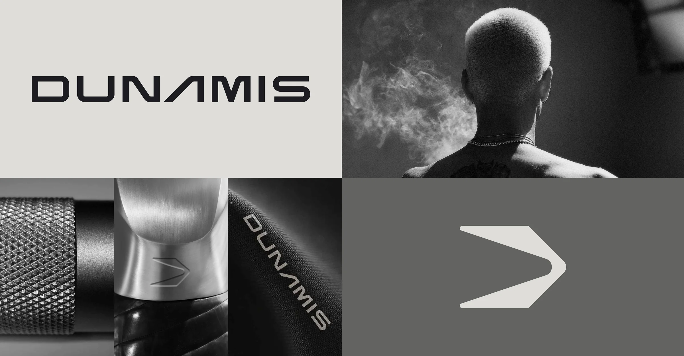
The strategy was simple: look like the future the product promises. The mark fuses three ideas into one geometric symbol, a trimmer silhouette, the letter D, and a forward chevron of momentum. A custom wide techno sans and a disciplined greyscale palette keep it premium, serious and unmistakably engineered.
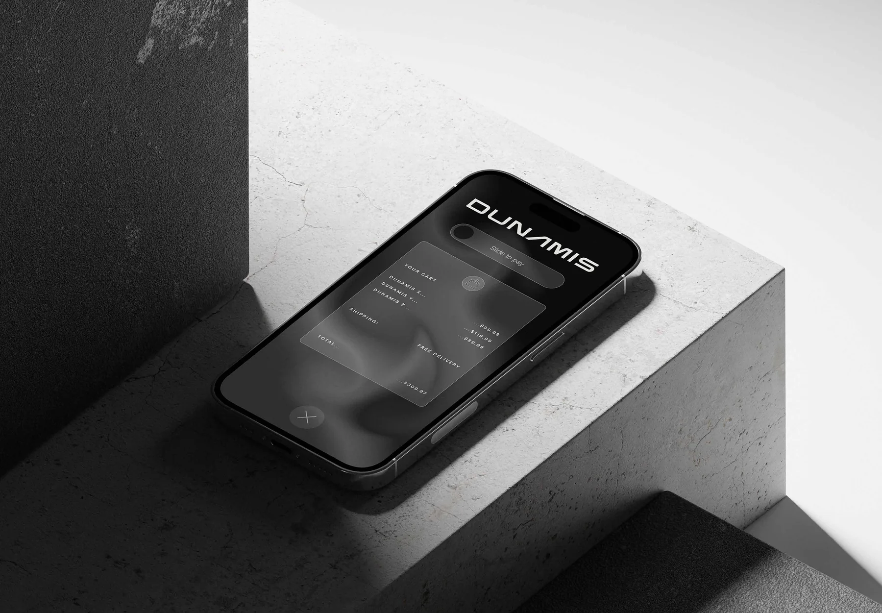
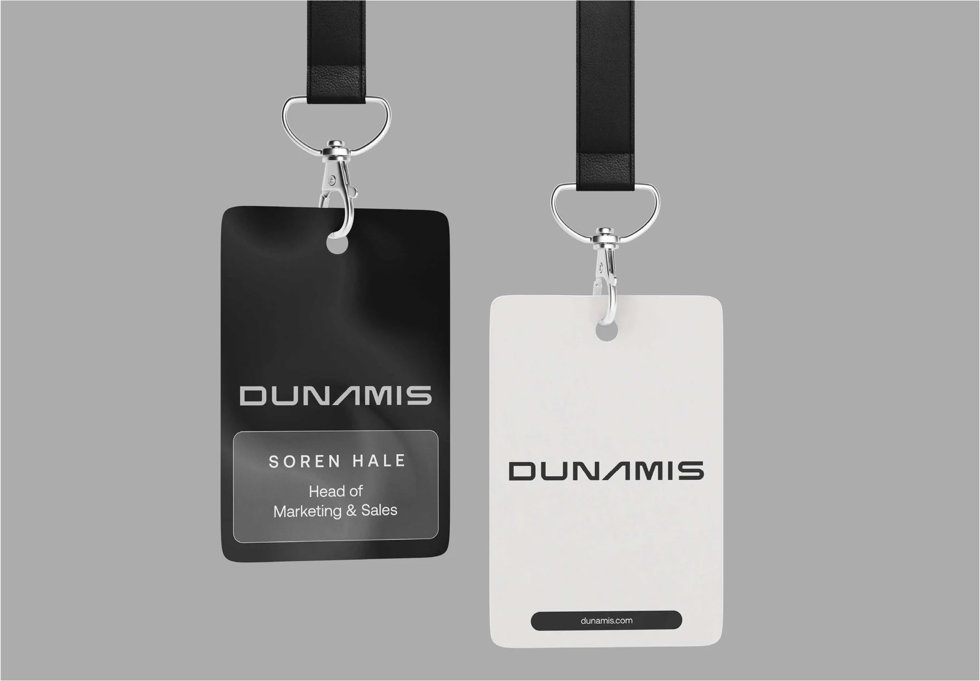
The result is a complete system that scales from a chevron engraved into brushed-steel hardware to a full mobile-commerce app. Confident, kinetic, and built to launch. Dunamis arrived with a brand that signals exactly what it set out to be: ahead.
“It looks like what we want to become: fast, sharp, impossible to ignore.”
Dunamis, Founders