UGM is one of Slovenia's leading contemporary art galleries, with a program that changes constantly. But its identity leaned almost entirely on the logo, and it was nowhere near flexible enough. A single fixed mark can't keep pace with show after show of new artists, so the brand boxed the work in instead of framing it.
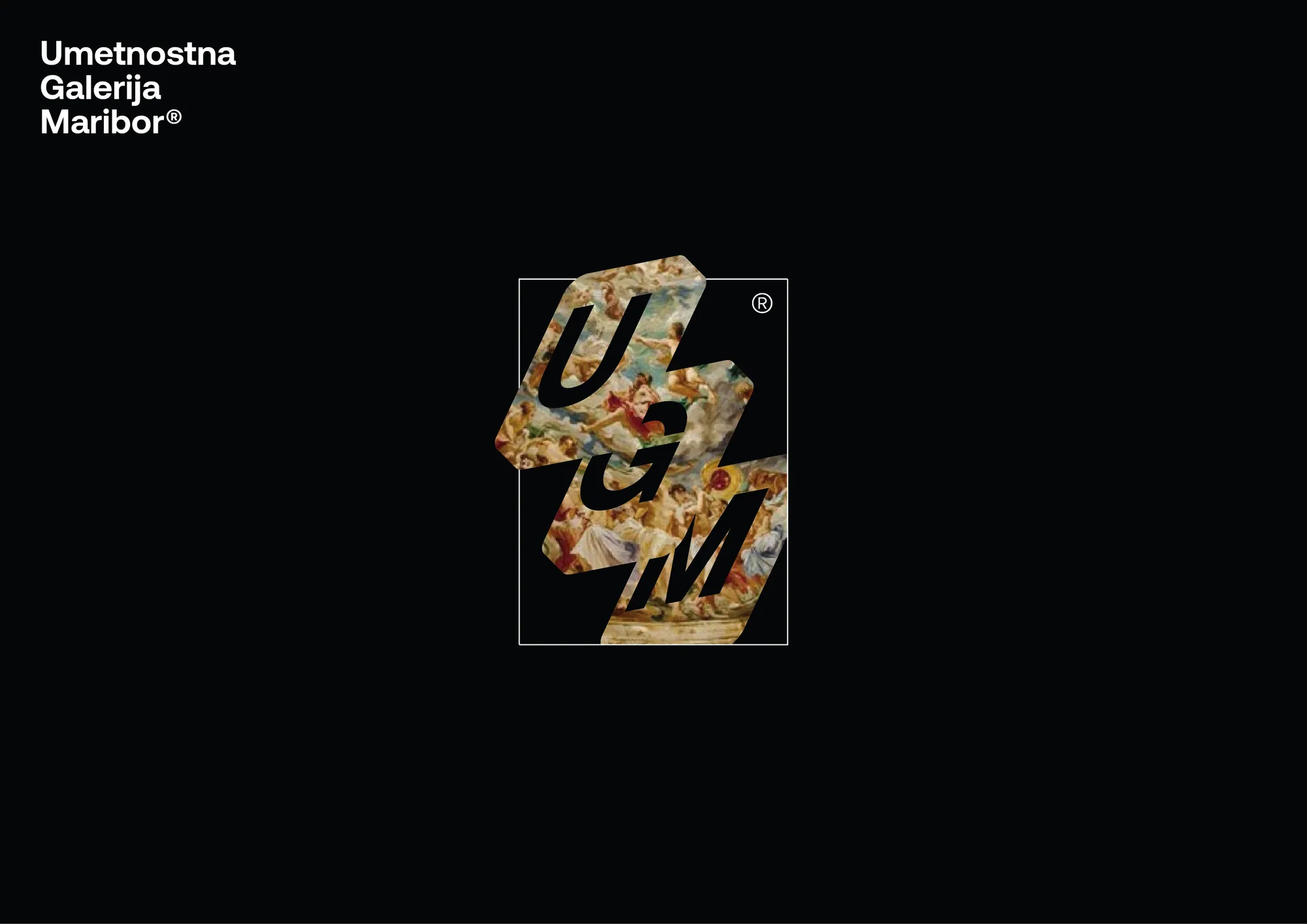
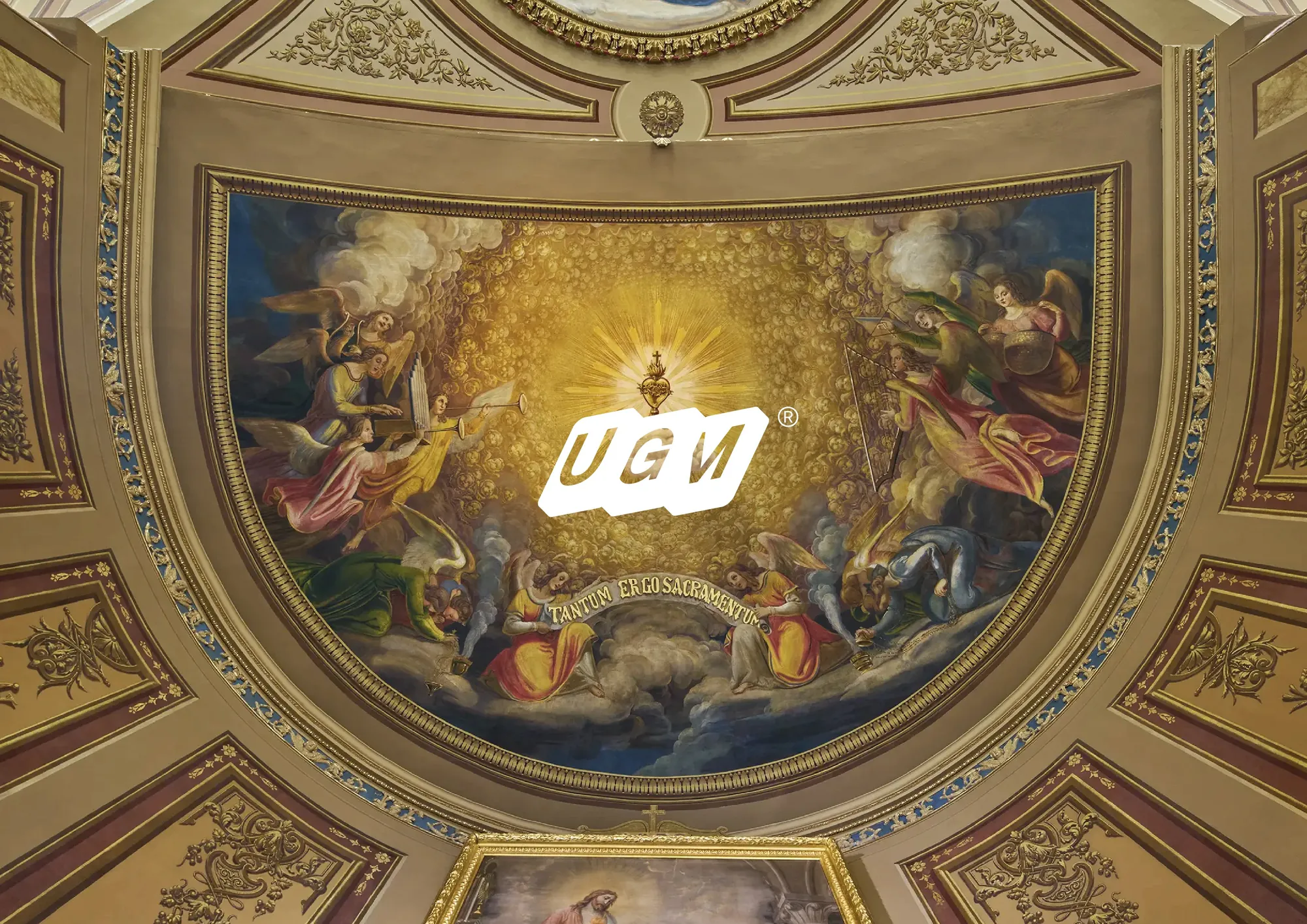
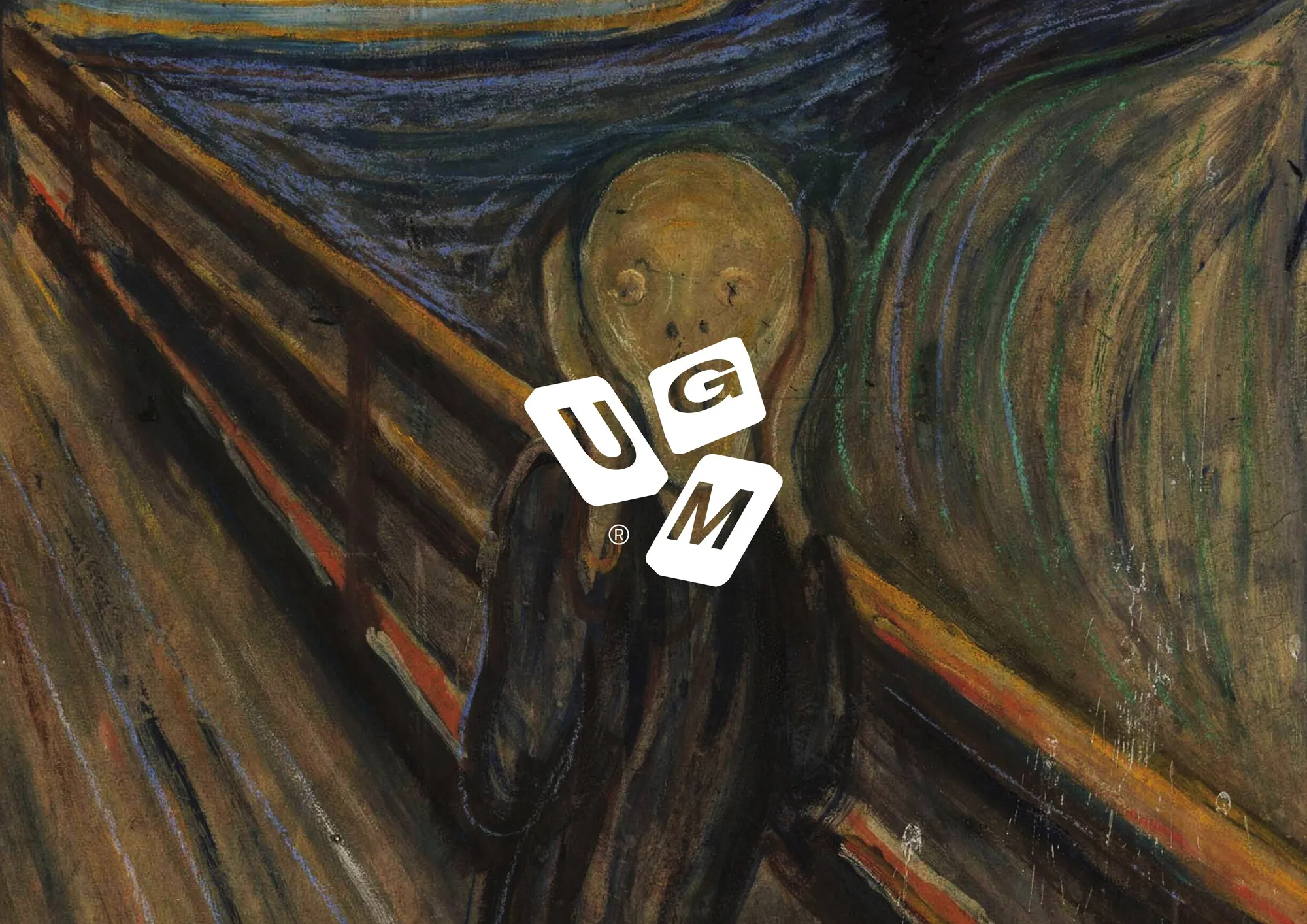
A gallery's brand shouldn't compete with the art on its walls. So instead of leaning on one mark, I built a flexible system: a frame that adapts to every exhibition while staying unmistakably UGM. The identity's job is to host the work and still be recognized as the gallery behind it.
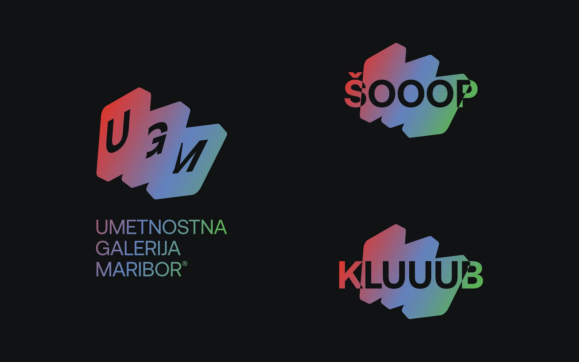
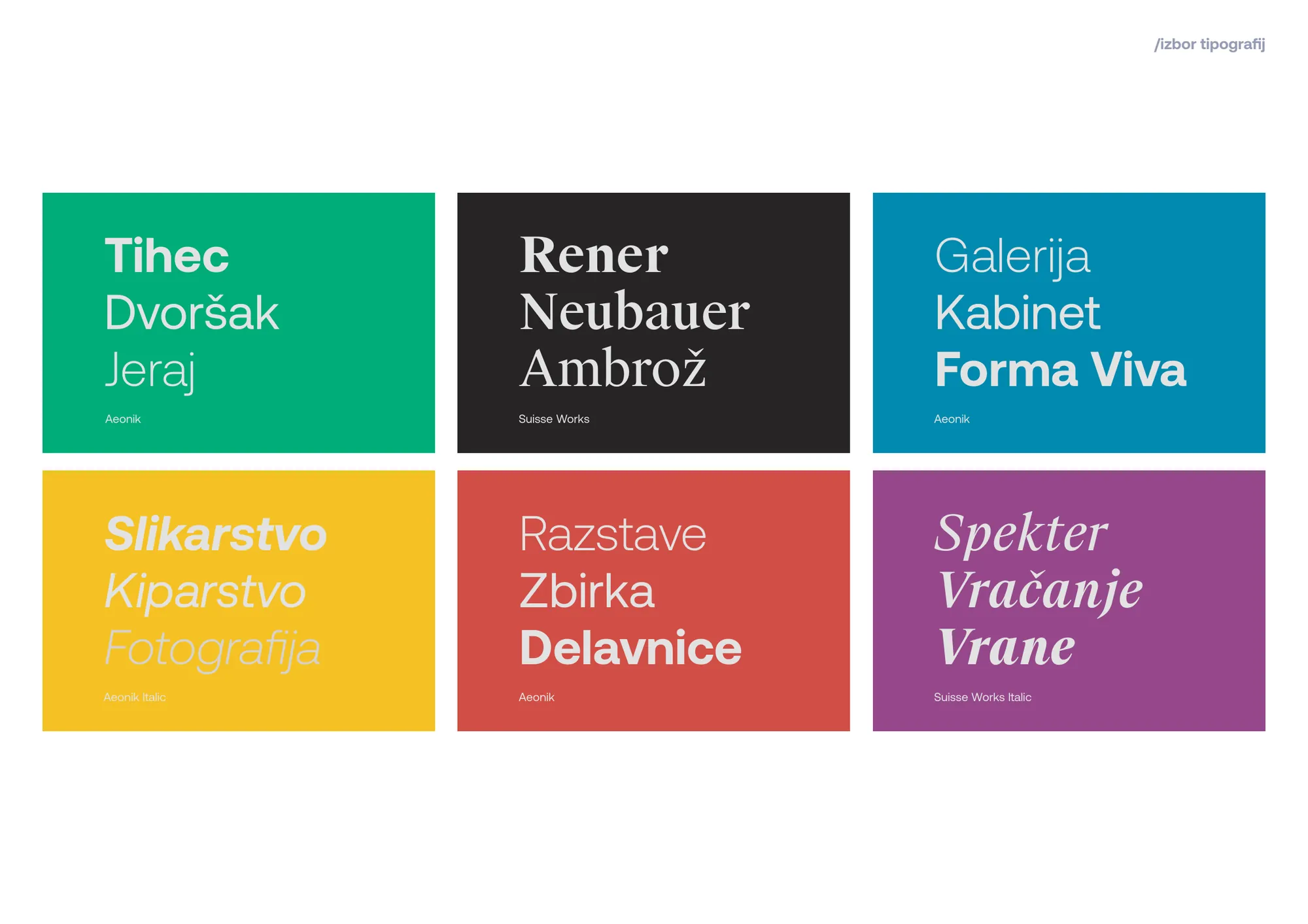
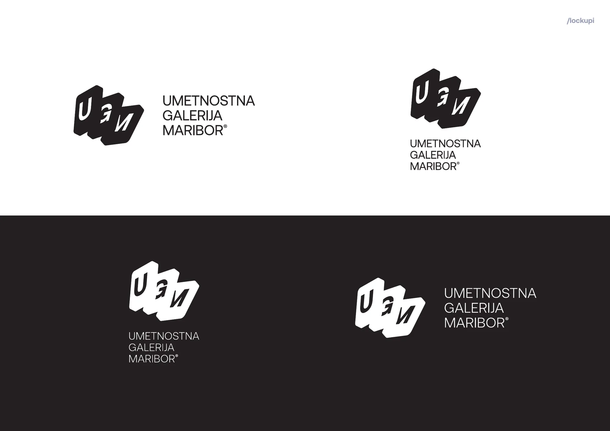
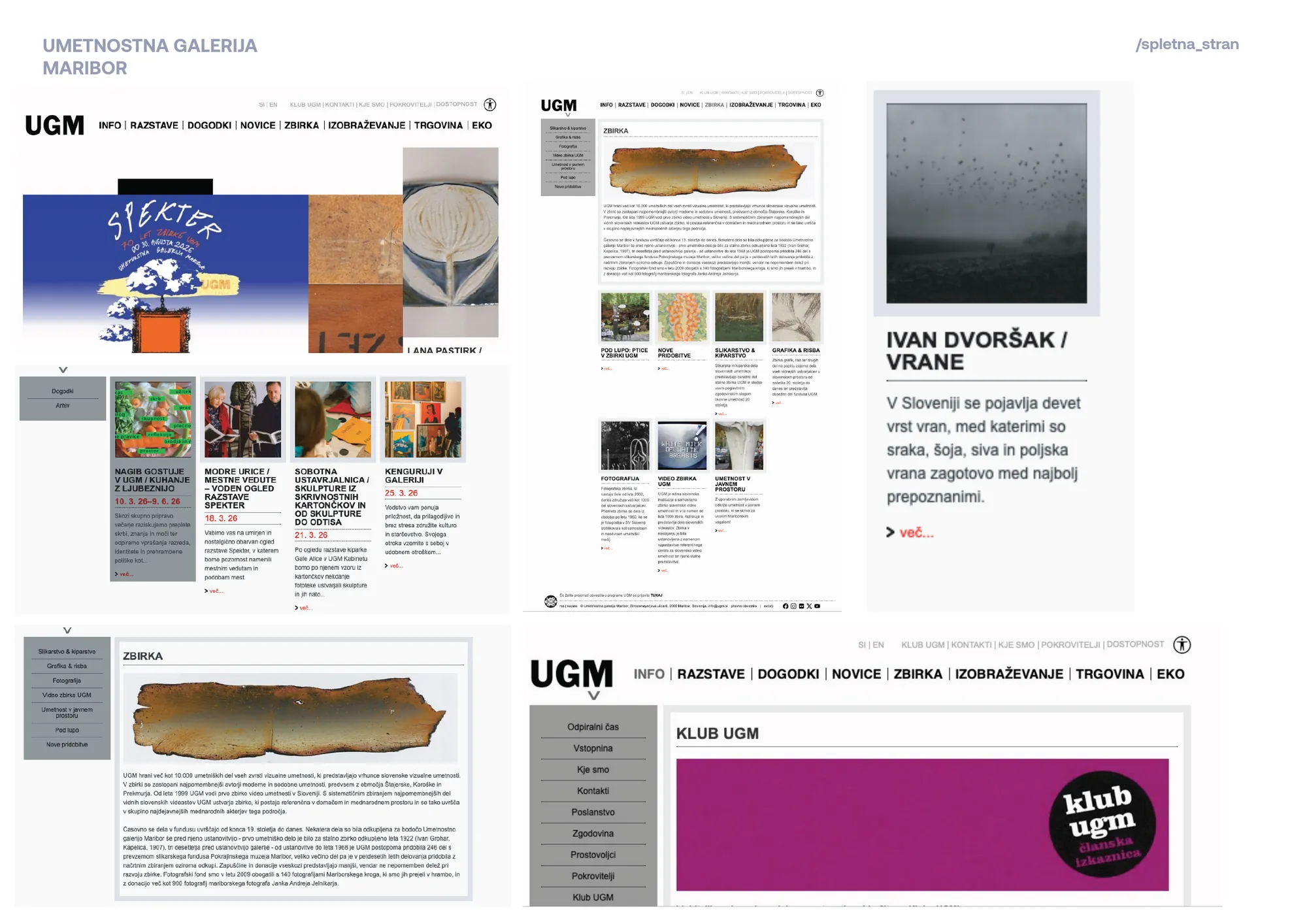
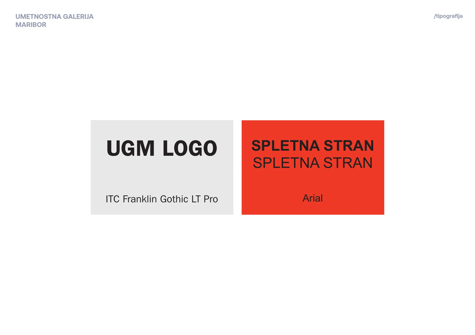
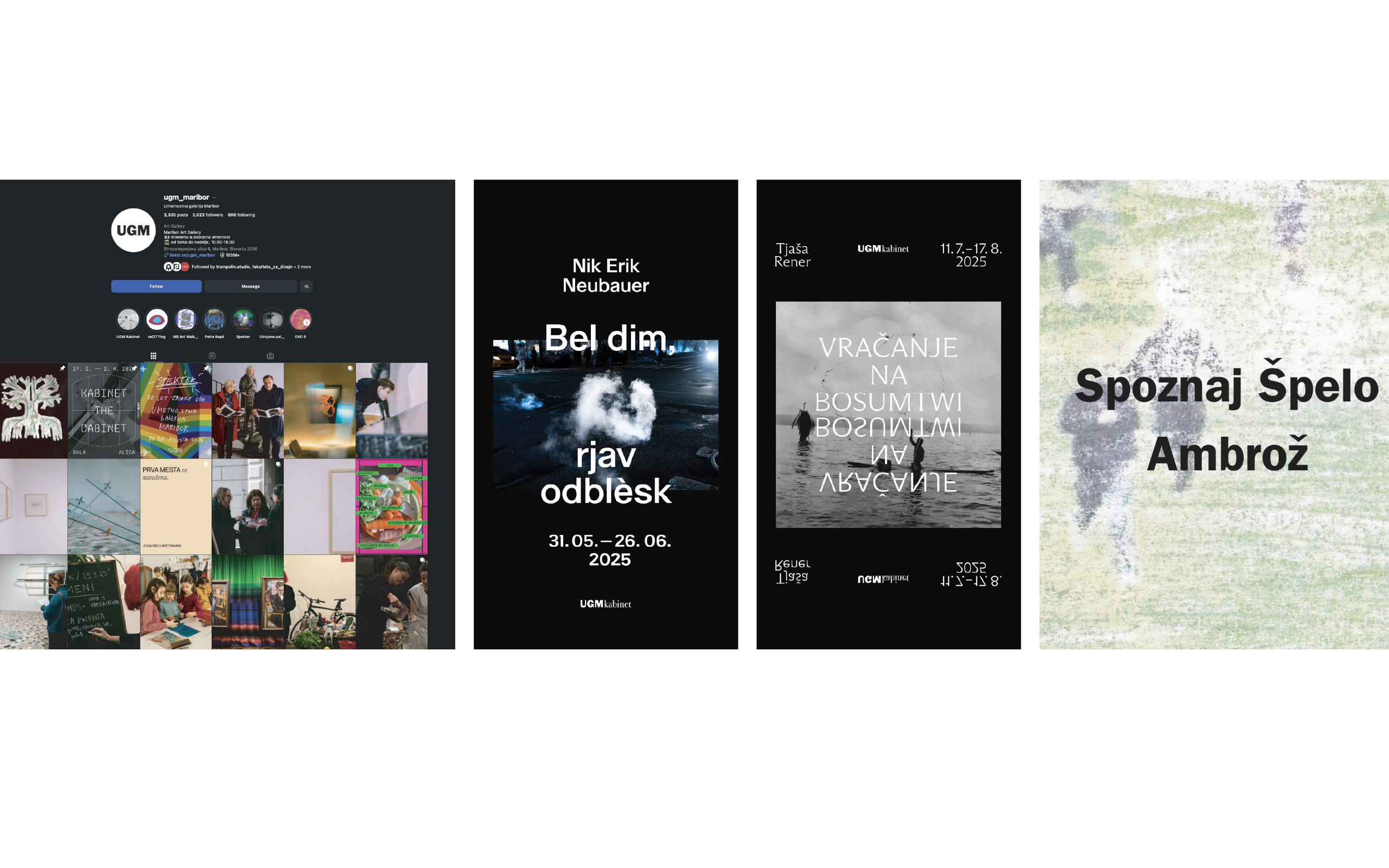
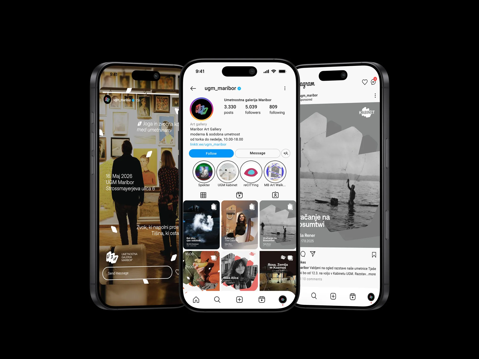
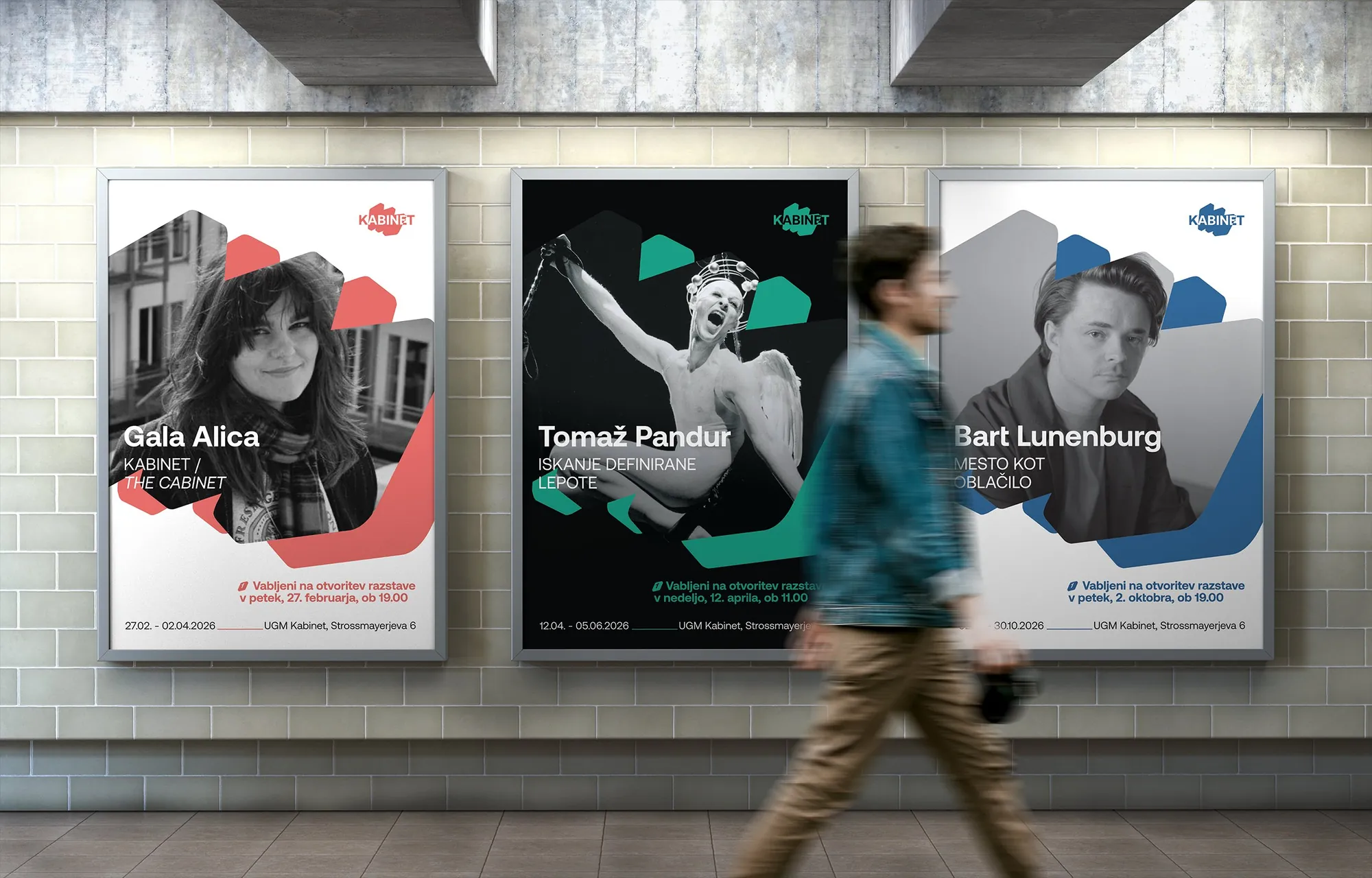
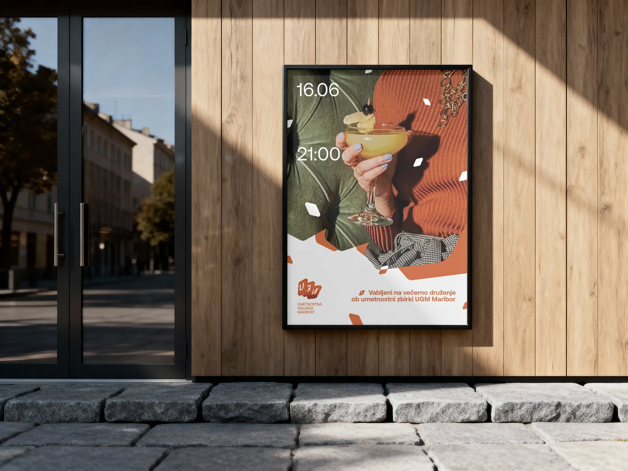
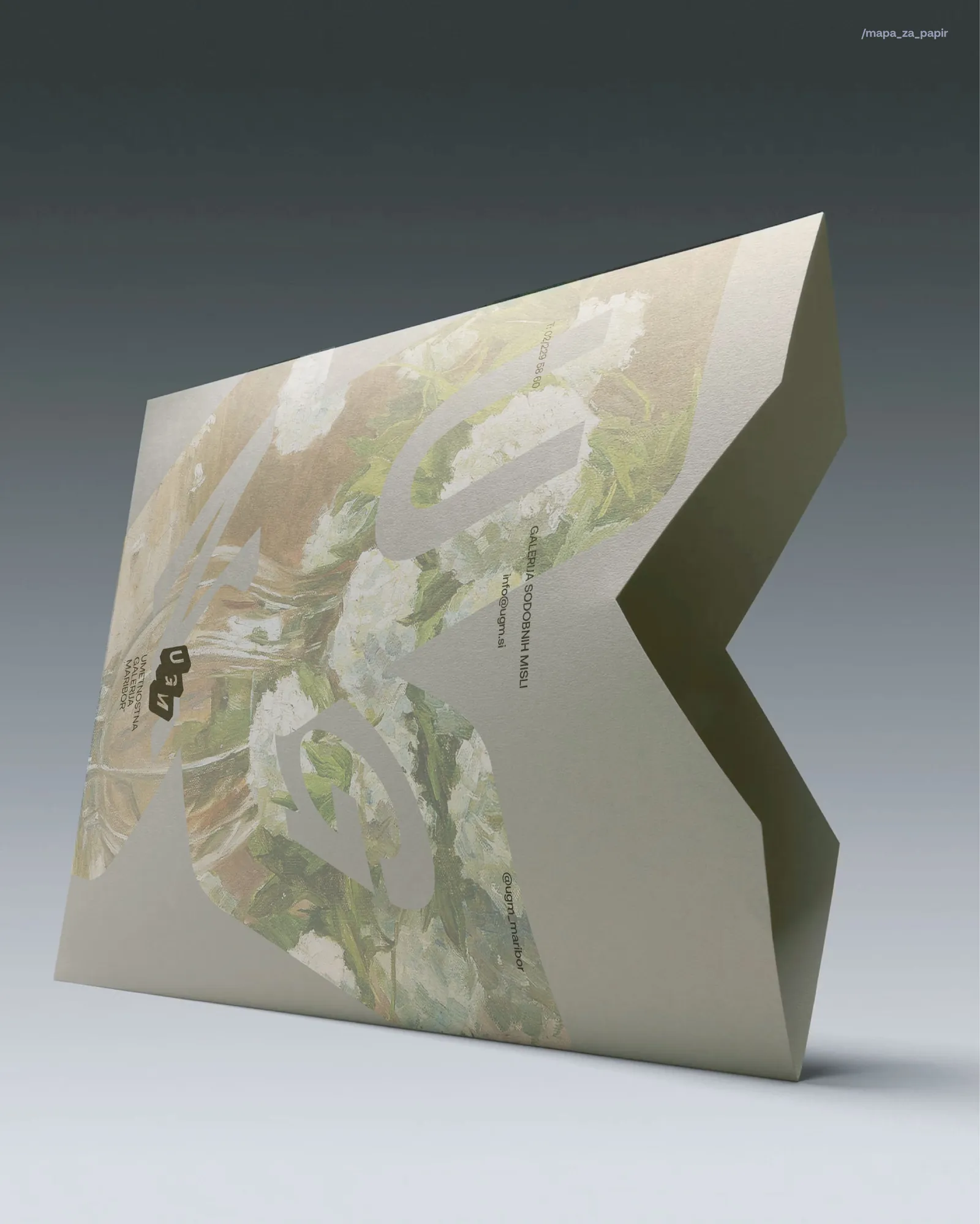
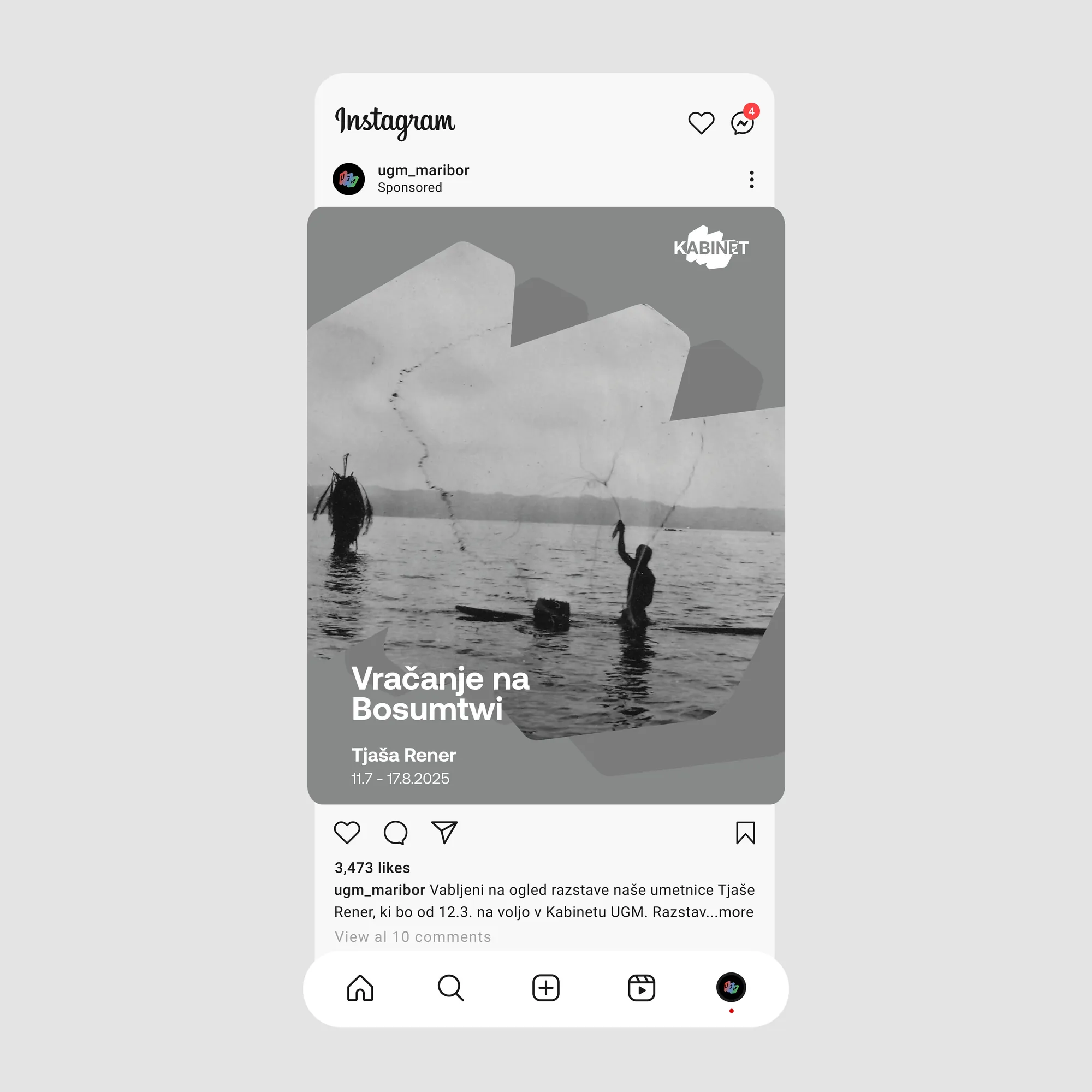
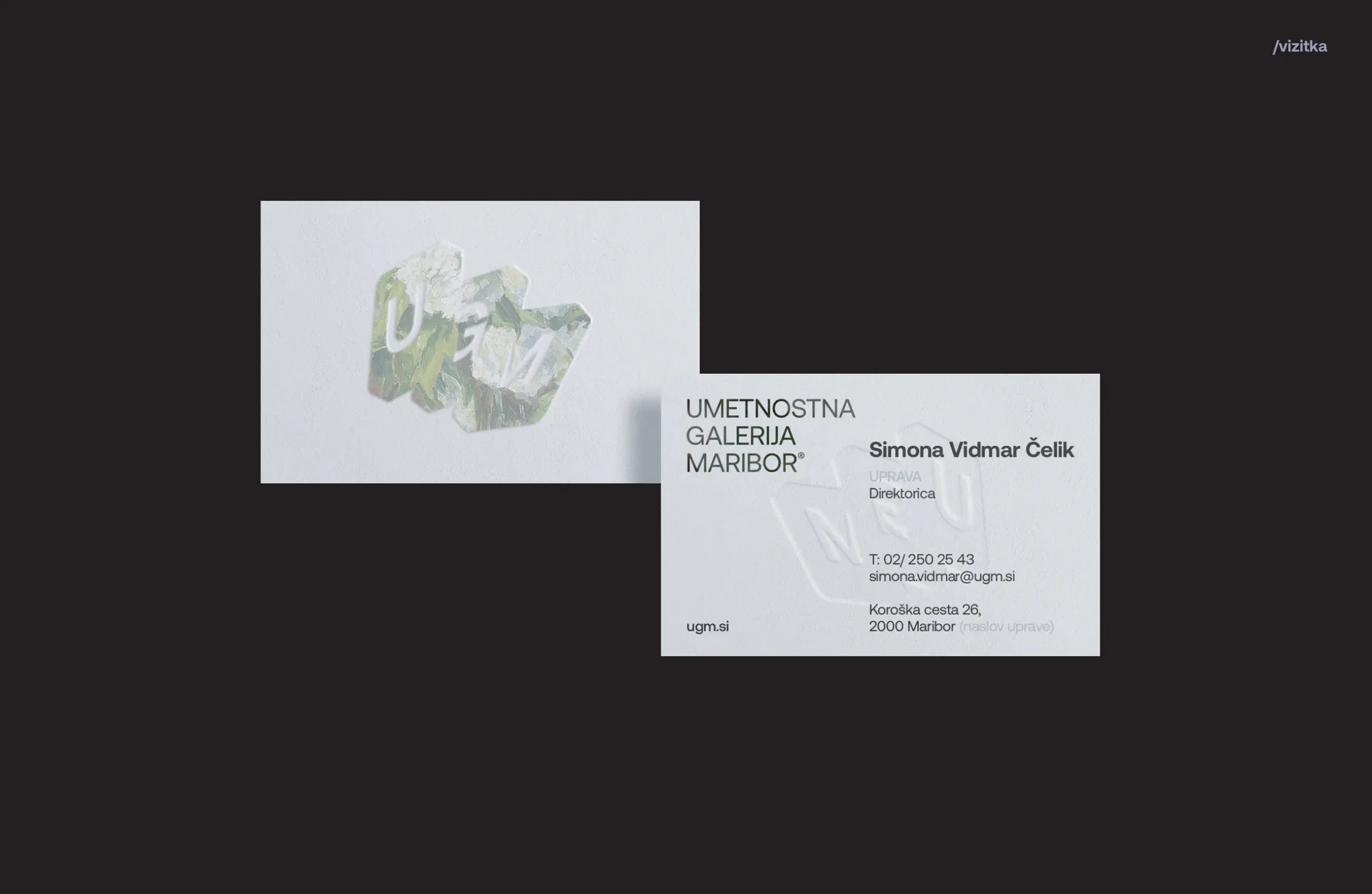
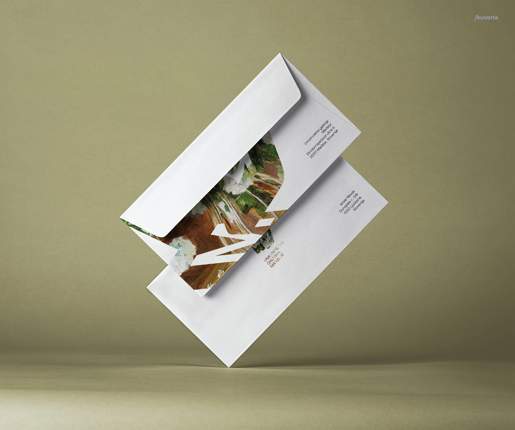
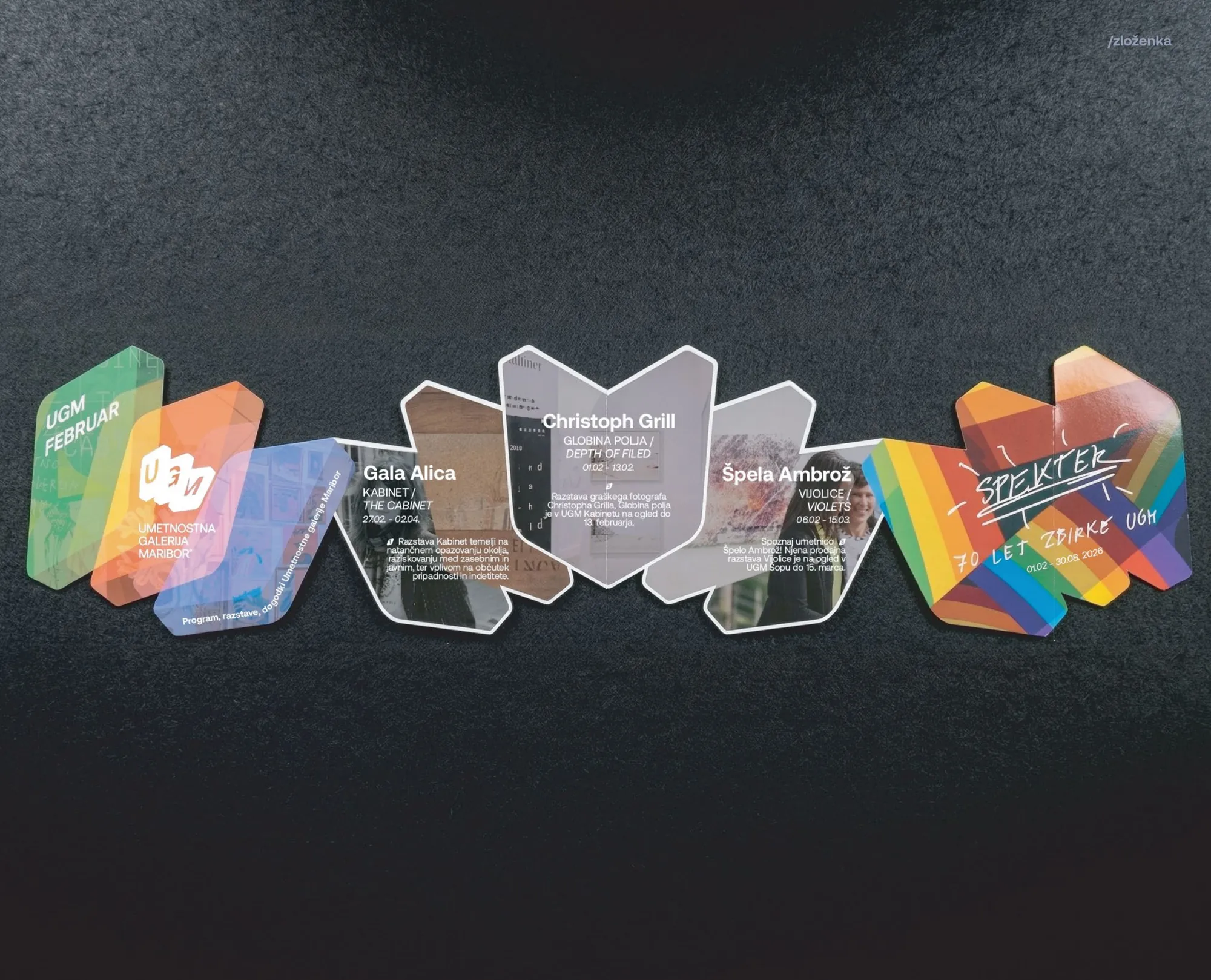
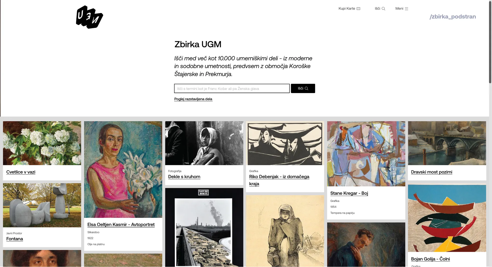
The result is a system, not just a logo. A bold UGM wordmark and a single decisive red anchor it, paired with a plain, confident type system that reads the same on a museum wall or a browser tab. It runs across posters, signage, the website and social, and the in-house team can recompose it for any show. Every artist gets room to lead, and the gallery stays recognizable underneath it all.
A proposed rebrand from a university project. The client engagement was simulated through the professor standing in for UGM, so the thinking and system are real, but there's no commissioned review to show.